CD/DVD Case Artwork Examples both good and bad:
Disc Image Artwork Examples:
Good: In this example of a good disc artwork image, the background goes smoothly to all edges including
the center. There is nothing important near the edges or the center
hub. The custom cd artwork image is square, not circular or masked (this is good).


Good Final: Our system creates the circular image and the edges and center hub part of the artwork is not printed on the
final disc. The key is to keep important text or artwork away from the edges and center.


Good: This is another example of a good disc artwork image. All text and
important artwork is in the ring area far away from edges, center, and corners.


Good Final: Keep all important text and artwork in the printed area ring, not the corners or center, or too close to the outer edge.


Bad: The text will get cut off because too much is located near the edges and not in the center disc area.
This image would be perfect for a CD case front panel but not for a disc image.


Bad Final:
Keep all important text and artwork in the printed area ring, not the corners or center, or too close to the outer edge.
The text is cut off both in the corners, top and in the non printed center hub area.


Personalized DVD Case Overwrap Artwork Examples:
Good original image. In this example of a good DVD Overwrap image, the background goes smoothly to all edges including
the center. There is nothing important near the edges (at least 1/4 inch). There are no borders, crop marks, or bleed marks on this custom dvd case artwork.
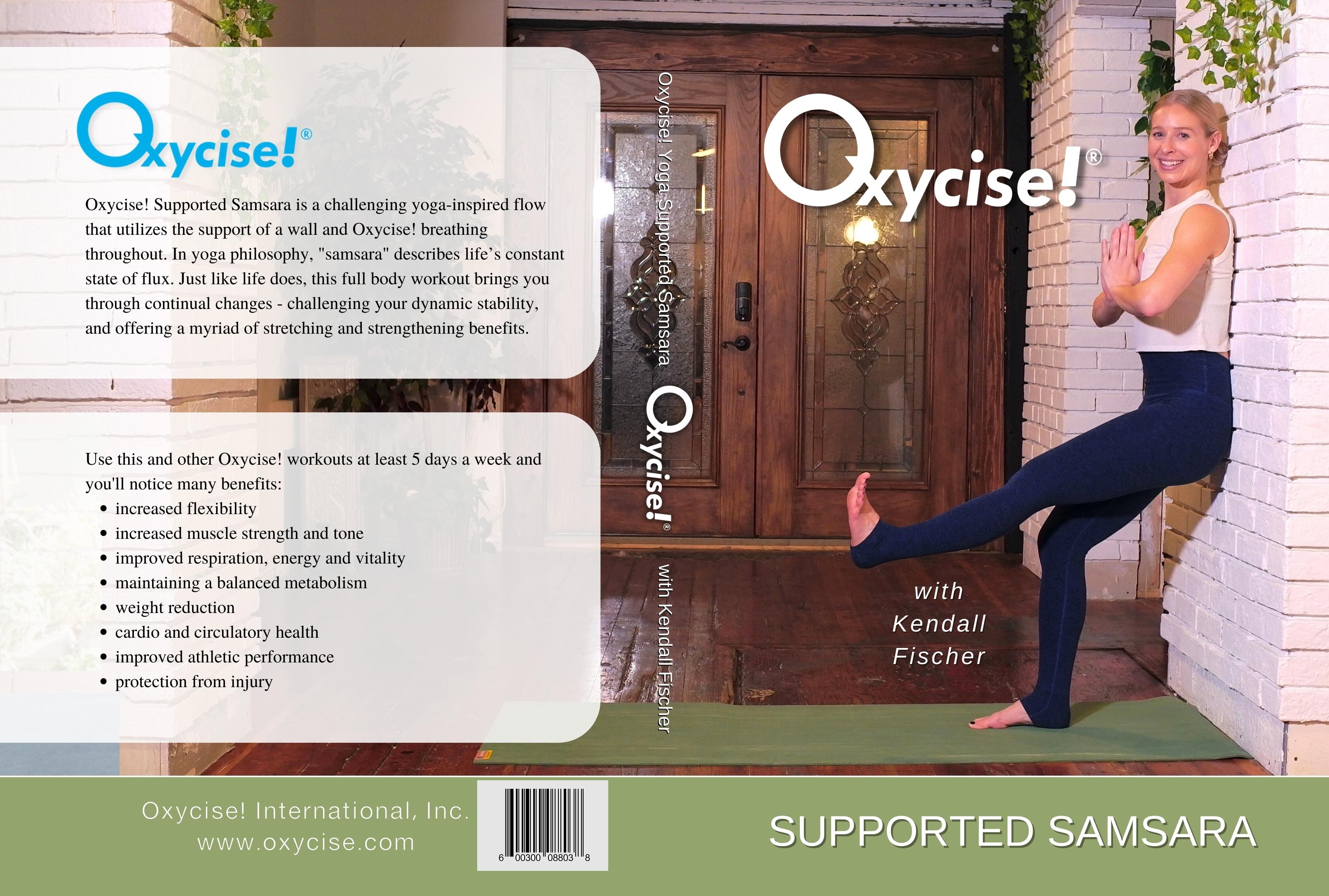

Good Final image. This is a rough idea of how the overwrap would be cut to the final size. You can see that even though a small amount
of the image has been trimmed, the bar code, and other text is not cut off because it was far enough away from the edges. Keep
important text and artwork away from the edges.
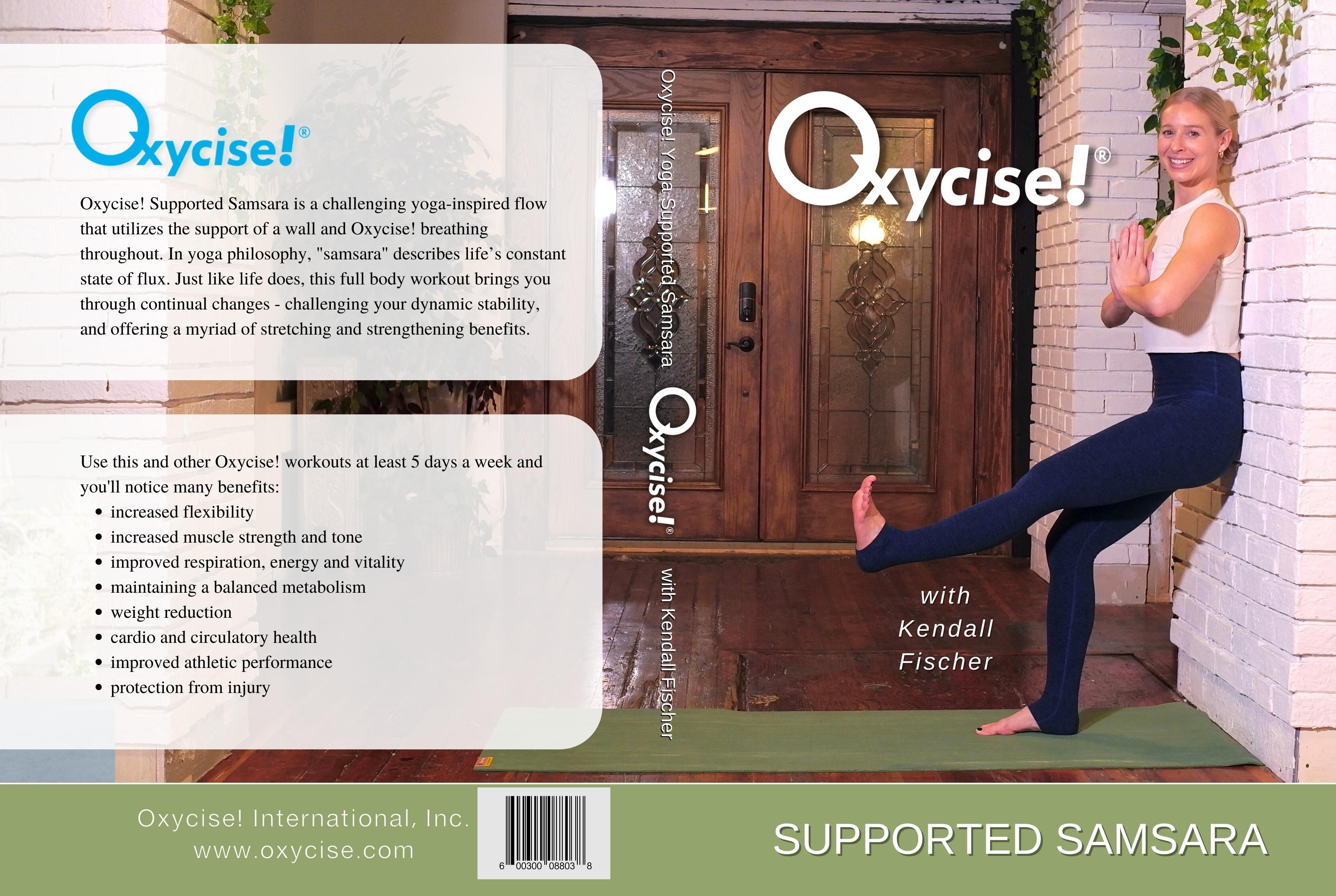

BAD original image. In this example of a poorly designed DVD Overwrap image, the artwork contains a green border instead of
a nice continuation of the background. Also, the important text and bar code are too close to the edge so it may
get cut off. Keep all imporant text, bar codes, and other artwork away from the edges.


Bad Final image. Since the cutting is never exactly centered, if you have a border near the edges, it makes it more obvious
that the cut is off center. You never want to have borders near the outside edge of any artwork that needs to be cut because
it will never be perfectly centered.


Inside DVD Case Insert Artwork Examples:
Good original image. In this example of a good DVD Inside panel image, the background goes smoothly to all edges including
the center. There is nothing important near the edges (at least 1/4 inch). There are no borders, crop marks, or bleed marks on this custom
inside panel artwork.


Good Final image. This is a rough idea of how the inside panel would be cut to the final size. You can see that even though a small amount
of the image has been trimmed, you can barely tell that it was trimmed slighly off center.
Keep important text and artwork away from the edges.


BAD original image. In this example of a bad DVD inside panel image, the artwork contains a gray border near the outside
edge instead of a nice continuation of the background. Do not include borders, cut marks, bleed marks, or have text or
bar codes too close to the edges.


Bad Final image. Since the cutting is never exactly centered, if you have a border near the edges, it makes it more obvious
that the cut is off center. You never want to have borders near the outside edge of any artwork that needs to be cut because
it will never be perfectly centered. Do not use borders, crop, or bleed marks.


Custom CD Label Jewel Case 2 Panel Folded Artwork Examples:
Good original image. In this example of a good CD case 2 panel image. The background goes smoothly to all edges.
There is nothing important near the edges (at least 1/4 inch). There are no borders, crop marks, or bleed marks on this custom
CD case artwork.


Good Final image. This is a rough idea of how the 2 panel image would be cut to the final size.
You can see that even though a small amount of the image has been trimmed, you can barely tell that it was trimmed slighly off center.
Keep important text, bar codes and artwork away from the edges.


BAD original image. In this example of a bad CD 2 panel image, the artwork contains text very close to the
left and top edges. Also, the barcode is too close to the bottom. Do not include borders, cut marks, bleed marks, or have text or
bar codes too close to the edges.


Bad Final image. Keep text and barcodes away from the edges or they might get cut off.
NOTE: We've modified the original artwork to use it as an example of what not to do. The original publisher
artwork was correct and had the text and bar code safely away from the edges so
nothing was cut off.


It's best if your custom cd/dvd case artwork:
- Is continuous from edge to edge.
- Nothing is too close to an edge or it may get cut off or not printed. We recommend you do not place text or anything important within 1/4 inch of any edge or disc hub area. This will ensure it will still look good after trimming (or disc printing).
- Do NOT put borders near the edges of the artwork in case printing or trimming is slightly off center.
- Try to use light coverage artwork for best results.
These same "best practices" still apply for all types of artwork printing including CD/Jewel cases.